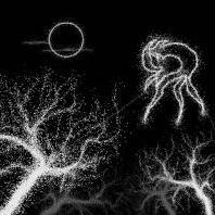
medieval_cortex Posted September 1, 2020 Share Posted September 1, 2020 (edited) This is my first project with Houdini that feel like my own as I haven't used a specific tutorial to make it happen. It's basically a tool that scatter dots alongside curves to get a cool noisy hand drawn style. This image was made from hand drawn curves in Houdini: The nice thing about it is that the curves can easily be animated with a P attribute randomize, which give this result: Of course you can also feed images or videos with a Trace node. I got this result from an image by animating the threshold value of the node: Coming back to the first image, here is how the curves look like in the Draw Curve node for one of the tree: Then I created a grid and painted a density attribute alongside the middle: Then I sweep the grid alongside the curves, as you can see (in white) the density attributes is passed along: Then I scatter points based on that density attribute, so the majority of them are toward the center of the branches: Then I remap the density attribute to basically invert it's value and rename it to pscale. Finally I copy to points circles (actual geometry), and thanks to that pscale value the circles furthest from the curves tend to be bigger which I find give the best look: Some final notes: - I actually have 3 scatter system with 3 different grid size, this give more control over the end result and make the inherent CGI-ness of the scattering less obvious. - I've exported all the objects in the first image as alembic and did my render in Blender where I feel more at ease to do my layout. - Even though I think it look better in 2D, this effect can totally be done in 3D with this setup, here is how a squab look like in the viewport: Let me know what you think, critics are more than welcome, if someone has done something similar (and most likely a lot better!) I'd love to see it. dot_generator.hiplc Edited September 1, 2020 by human_robot 1 Quote Link to comment Share on other sites More sharing options...
Librarian Posted September 1, 2020 Share Posted September 1, 2020 Love it ! If you can explain How you do ? Particles or ? What drive those colors ? just some process ....maybe some File example Quote Link to comment Share on other sites More sharing options...
medieval_cortex Posted September 1, 2020 Author Share Posted September 1, 2020 (edited) 31 minutes ago, Librarian said: Love it ! If you can explain How you do ? Particles or ? What drive those colors ? just some process ....maybe some File example Thank you! It's funny I was looking at your work 5 minutes ago, great stuff! Actually I wanted to upload the file but forgot... I've added it to my post! dot_generator.hiplc Edited September 1, 2020 by human_robot 1 Quote Link to comment Share on other sites More sharing options...
Recommended Posts
Join the conversation
You can post now and register later. If you have an account, sign in now to post with your account.
Note: Your post will require moderator approval before it will be visible.